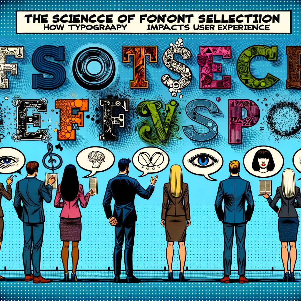
The Science of Font Selection: How Typography Impacts User Experience
Updated on
February 15, 2025
The Science of Font Selection: How Typography Impacts User Experience
Typography is often overlooked in web design, but it plays a crucial role in creating a seamless user experience. The fonts you choose for your website can significantly impact readability, brand perception, and even conversion rates. In this blog post, we’ll explore the science behind font selection and share practical tips to help you make informed decisions that elevate your website’s user experience.
The Psychology of Typography
Typography is more than just a visual element; it’s a powerful communication tool that can evoke emotions and influence user behavior. The right font choice can make your content more engaging, trustworthy, and memorable. On the other hand, poor typography can lead to confusion, frustration, and a negative user experience.
Emotional Resonance of Fonts
Different fonts carry different emotional weights. For example, serif fonts like Times New Roman or Georgia often evoke a sense of tradition, reliability, and formality. They are commonly used by institutions that want to project authority and trustworthiness. In contrast, sans-serif fonts like Arial or Helvetica convey modernity, simplicity, and cleanliness, making them popular choices for tech companies and contemporary brands.
Script and decorative fonts can add elegance, creativity, or whimsy to your design, but they should be used sparingly to avoid overwhelming the reader. Understanding the emotional connotations of various font styles can help you choose typography that aligns with your brand’s personality and message.
Cultural Influences on Font Perception
Typography does not exist in a vacuum; cultural factors can significantly influence how fonts are perceived by different audiences. A font that seems friendly and approachable in one culture might be interpreted differently in another. For instance, certain font styles or characters may carry specific meanings or associations in different languages or regions.
When designing for a global audience, it’s essential to consider these cultural nuances. Research your target demographic to understand any cultural implications of your font choices. This ensures that your typography resonates positively with users from diverse backgrounds and avoids unintended misunderstandings.
Readability: The Foundation of Good Typography
Readability is the ultimate goal of web typography. If your content is difficult to read, users are more likely to abandon your website, regardless of how visually appealing it may be. Several factors contribute to readability, including font size, line spacing, contrast, and character spacing.
Optimal Font Sizes and Line Lengths
Choosing the right font size is essential for readability. While there is no one-size-fits-all solution, a general guideline is to use a font size of at least 16px for body text to ensure legibility on most devices. Additionally, consider the line length of your text. Research suggests that lines of text between 50 to 75 characters are optimal for readability. Longer lines can cause users to lose their place, while shorter lines may disrupt the reading flow.
Adjusting line spacing, or leading, can also enhance readability. Increasing the space between lines prevents text from feeling cramped and makes it easier for the eye to move from one line to the next. A leading value of 120% to 150% of the font size is commonly recommended for body text.
Contrast and Color Considerations
The contrast between text and background colors significantly impacts readability. High contrast, such as black text on a white background, provides maximum readability. However, using stark contrasts can cause eye strain over long periods. Softening the contrast slightly, like dark gray text on an off-white background, can improve comfort without sacrificing readability. Avoid low-contrast combinations, such as light gray text on a white background, as they can make reading difficult, especially for users with visual impairments.
Typography Hierarchy and Content Organization
Effective typography not only involves choosing the right fonts but also organizing text in a way that guides the reader through your content. Typographic hierarchy establishes an order of importance within your content, allowing users to easily navigate and understand the information presented.
Establishing Visual Hierarchy
Visual hierarchy is achieved by manipulating typographic elements such as size, weight, color, and spacing. Headings, subheadings, and body text should be clearly differentiated to create a structured layout. Larger font sizes and bold weights draw attention to primary headings, while smaller sizes and lighter weights designate lower-level headings and body text.
Consistent use of hierarchy helps users scan your content efficiently, finding the information they seek without frustration. It also enhances the overall aesthetic appeal of your website, making it more engaging and professional.
Importance of White Space
White space, or negative space, refers to the empty areas around text and images. Proper use of white space improves readability by preventing the layout from feeling cluttered. It allows the content to breathe and helps direct the reader’s focus to key elements.
Incorporating adequate margins, padding, and line spacing enhances the user experience by making your content more accessible and less overwhelming. White space is a fundamental aspect of minimalist design, emphasizing simplicity and clarity.
Pairing Fonts: A Delicate Balance
While it’s tempting to use a single font for your entire website, pairing complementary fonts can add visual interest and hierarchy to your content. However, it’s essential to strike a balance and avoid using too many fonts, which can create a disjointed and overwhelming experience.
Strategies for Effective Font Pairing
When pairing fonts, consider their classification (serif, sans-serif, script, etc.), weight, and overall style. Contrasting fonts can work well together, but they should still share some visual similarities to maintain cohesion. Here are some strategies for effective font pairing:
- Hierarchy-Based Pairing: Use different fonts to establish a visual hierarchy. For example, use a bold, attention-grabbing font for headings and a simple, easy-to-read font for body text.
- Concordant Pairing: Choose fonts from the same family but with different weights or styles. This approach ensures consistency while providing enough variation to distinguish between different types of content.
- Contrasting Pairing: Combine fonts with contrasting styles, such as a serif and a sans-serif font. This method creates visual interest but requires careful selection to ensure the fonts complement each other.
Avoiding Common Mistakes
- Limit the Number of Fonts: Stick to two or three fonts to maintain a cohesive design.
- Ensure Legibility: Decorative fonts should be used sparingly and not for body text.
- Test for Compatibility: Fonts should work well together aesthetically and functionally across different browsers and devices.
Responsive Typography: Adapting to Different Devices
In today’s multi-device world, it’s crucial to consider how your typography will adapt to different screen sizes and resolutions. Responsive typography ensures that your content remains readable and visually appealing across various devices, from desktop computers to smartphones.
Techniques for Responsive Typography
-
Fluid Typography: Use CSS techniques to adjust font sizes relative to the viewport size. By using units like
vw(viewport width) orvh(viewport height), you can create font sizes that scale smoothly across different screen sizes. - Media Queries: Implement media queries to change font properties at specific breakpoints. For example, increase font size and line spacing on smaller screens to enhance readability.
-
Relative Units: Utilize relative units such as
emorreminstead of absolute units likepx. This approach allows text to scale appropriately based on user settings or parent elements.
Optimizing for Performance
Loading custom fonts can impact website performance, especially on mobile devices with limited bandwidth. To mitigate this:
- Use Web-Safe Fonts: When possible, use web-safe fonts that don’t require additional downloads.
- Subset Fonts: Include only the necessary characters in your font files to reduce file size.
- Implement Font Loading Strategies: Use techniques like font preloading or asynchronous loading to improve perceived performance.
Typography and Accessibility
Accessibility should be a priority when designing for the web, and typography plays a significant role in ensuring your content is inclusive and accessible to all users. Factors like color contrast, font size, and line spacing can impact the readability of your content for users with visual impairments or cognitive disabilities.
Adhering to Accessibility Guidelines
Following guidelines such as the Web Content Accessibility Guidelines (WCAG) can help you create a more inclusive experience:
- Color Contrast: Ensure sufficient contrast ratio between text and background colors. WCAG recommends a contrast ratio of at least 4.5:1 for normal text.
- Scalable Text: Allow users to resize text without breaking the layout. Avoid using fixed units for font sizes.
- Clear Typography: Choose fonts that are easy to read, avoiding overly decorative fonts for essential content.
Providing Alternatives and Enhancements
- Accessible Web Fonts: Some fonts are specifically designed to enhance readability for users with dyslexia or other reading difficulties.
- Semantic Markup: Use proper HTML tags to structure your content, aiding screen readers and other assistive technologies.
- Focus Indicators: Ensure interactive elements like links and buttons have visible focus indicators for keyboard navigation.
Tools for Testing Accessibility
To ensure your typography meets accessibility standards, utilize tools designed to evaluate various aspects of your website:
- Color Contrast Analyzers: These tools help you check the contrast ratio between text and background colors to ensure compliance with accessibility guidelines.
- Screen Readers: Testing your website with screen readers can reveal how accessible your content is to users who rely on these technologies.
- Accessibility Auditing Tools: Automated tools can scan your website for common accessibility issues, providing reports and suggestions for improvements.
Regular testing and adjustments based on these insights will make your website more accessible to a wider audience.
The Technical Side of Web Typography
Beyond aesthetics and readability, understanding the technical aspects of web typography is essential for optimal performance and user experience.
Font Formats and Browser Support
Different browsers support different font formats. Common web font formats include:
- WOFF and WOFF2: Web Open Font Format is widely supported and optimized for the web.
- EOT: Embedded OpenType is primarily used for older versions of Internet Explorer.
- TTF and OTF: TrueType and OpenType fonts are supported by most modern browsers.
Including multiple font formats ensures broader compatibility across different browsers.
Implementing Fonts with CSS
Using the @font-face rule in CSS allows you to include custom fonts on your website:
@font-face {
  font-family: 'CustomFont';
  src: url('customfont.woff2') format('woff2'),
       url('customfont.woff') format('woff');
  font-weight: normal;
  font-style: normal;
}
Once defined, you can use the custom font in your styles:
body {
  font-family: 'CustomFont', sans-serif;
}
Managing Font Loading
Font loading can affect page rendering and performance. Implement strategies like:
- Font Loading API: Control how fonts are loaded and when they are applied.
- Fallback Fonts: Define fallback fonts to display while custom fonts load to avoid a flash of invisible text (FOIT).
-
Font Display Descriptors: Use the
font-displayproperty to specify how fonts are rendered during loading:
@font-face {
  font-family: 'CustomFont';
  src: url('customfont.woff2') format('woff2');
  font-display: swap;
}
Utilizing Web Font Services
Web font services offer vast libraries of fonts and tools to simplify font management on your website. These services handle cross-browser compatibility, licensing, and performance optimization.
-
Benefits of Using Web Font Services:
- Easy Implementation: Add fonts by including a link or script provided by the service.
- Optimized Delivery: Fonts are delivered via Content Delivery Networks (CDNs), improving load times.
- Licensing Compliance: Ensures you have the proper rights to use fonts on your website.
When choosing a web font service, consider factors like font selection, pricing, and performance features to find the best fit for your needs.
Variable Fonts: The Future of Web Typography
Variable fonts are an emerging technology that allows a single font file to behave like multiple fonts. They enable designers to adjust weight, width, slant, and other attributes dynamically.
Benefits of Variable Fonts
- Performance Gains: Reduce the number of font files, decreasing load times.
- Design Flexibility: Fine-tune typographic properties without loading additional fonts.
- Responsive Design: Adjust font attributes in response to screen size or user preference.
Implementing Variable Fonts
Use CSS to access variable font axes:
h1 {
  font-family: 'VariableFont', sans-serif;
  font-variation-settings: 'wght' 700, 'wdth' 75;
}
Variable fonts are supported in most modern browsers, but always provide fallbacks for compatibility.
Best Practices for Variable Fonts
- Define Fallbacks: Specify alternative fonts for browsers that do not support variable fonts.
- Test Across Devices: Ensure that variations render correctly on different screens and resolutions.
- Optimize Loading: Even though variable fonts reduce file numbers, they can be larger in size. Compress font files and use efficient loading strategies.
By adopting variable fonts thoughtfully, you can enhance your website’s typography while maintaining performance.
Testing and Iteration: The Key to Success
Typography is a complex and subjective aspect of web design, and what works for one website may not work for another. Therefore, it’s essential to test and iterate your font choices to ensure they align with your brand identity and resonate with your target audience.
User Testing and Feedback
Conduct user testing sessions to gather feedback on readability and aesthetic appeal. Observe how users interact with your content and note any difficulties they experience.
Consider surveys or interviews to collect subjective opinions about your typography choices. Users may provide insights into how the fonts make them feel and whether they perceive your brand as intended.
A/B Testing
Implement A/B testing to compare different typography options. Test variables such as font choices, sizes, and line spacing to determine which combinations yield better engagement or conversion rates.
By measuring user interactions with each version, you can make data-driven decisions to optimize your typography. Remember to change only one variable at a time to identify the specific impact of each change.
Utilizing Analytics for Typography Decisions
Leverage website analytics to inform your typography choices. Metrics such as time on page, bounce rate, and scroll depth can indicate how users engage with your content.
- Time on Page: Longer time may suggest that content is engaging and readable.
- Bounce Rate: High bounce rates might indicate that users are discouraged by the design or readability issues.
- Conversion Rates: Track how typography changes affect goal completions, such as sign-ups or purchases.
By correlating typography adjustments with changes in these metrics, you can gain insights into what resonates with your audience.
Continuous Improvement
Typography trends and technologies evolve. Stay updated with the latest developments and be prepared to adapt your typographic choices accordingly. Regularly review your website’s typography to ensure it remains effective and relevant.
Engage with design communities, attend webinars, and read industry publications to keep abreast of new techniques and best practices. Embracing a mindset of continuous improvement will help you maintain a competitive edge.
Conclusion
Typography is a powerful tool that can significantly impact the user experience of your website. By understanding the science behind font selection, considering readability, organizing content effectively, pairing fonts thoughtfully, embracing responsive design, and prioritizing accessibility, you can create a visually appealing and user-friendly website that resonates with your audience.
Remember that typography is both an art and a science. Finding the perfect balance requires careful consideration, testing, and iteration. Embrace the process, experiment with different font combinations, and always keep the user experience at the forefront of your design decisions. By doing so, you’ll not only enhance the aesthetic appeal of your website but also strengthen your brand and improve user engagement.